MyKee GPS Tracker
Overview:
My Role: Sole Designer
Tools: Pen and paper, Figma, Protopie, Notion, Cinema 4D Lite, After Effects, Shapr3D
Activities: In-person research, User Flows, Wireframes, Prototyping, Usability Testing
Team: Myself and the CEO
Timeframe: Less than a month for all design work shown here
The Background
This project is for a company which I co-founded. MyKee was a subsidiary of Collaboarator LLC which Seth Kitchen and I started a few years ago, and has since been dissolved. Seth created the first version of the MyKee product on his own, and I became involved in preparation for the next product in the line up "MyKee Live."
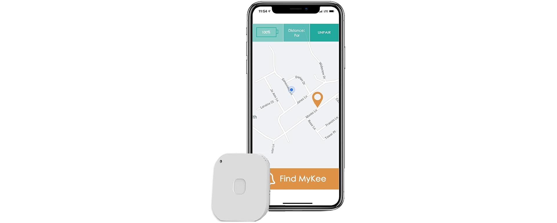
The MyKee Classic that the company produced is a simple bluetooth GPS tracker. It logs the last location that your phone connected to the tracker and you can see it in the app. It displays approximate distance and also allows you to make the device ring when in range.
The device that never came to be was the Mykee Live. This version would have had an onboard SIM card so it does not require a connection to your phone to log its location.
You would have been able to connect to as many MyKee lives as you wanted to.
Analysis of Current State
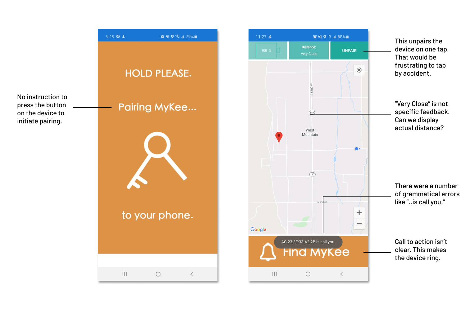
As I had been completely uninvolved with the MyKee project up to this point, I had the opportunity to experience the entire purchase process as a first time customer. I documented my experience and learned exactly where we need to improve the current product as well as avoid those pitfalls for the Live version.
This is the image on the Amazon page for MyKee.
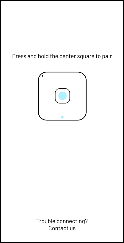
When the product arrived, it was in an unmarked box. There were no instructions inside either. A customer that didn't know that they needed the app or forgot what it was called would have no way of using the tracker. When I did download the app, it immediately went to the screen below to the left. This led me to believe that the phone had already found the device and was beginning to pair. Only after waiting 5 minutes on this screen and restarting the app twice did I realize that the indent on the face of the tracker was actually a button. I needed to press and hold that to pair.
Establishing Requirements
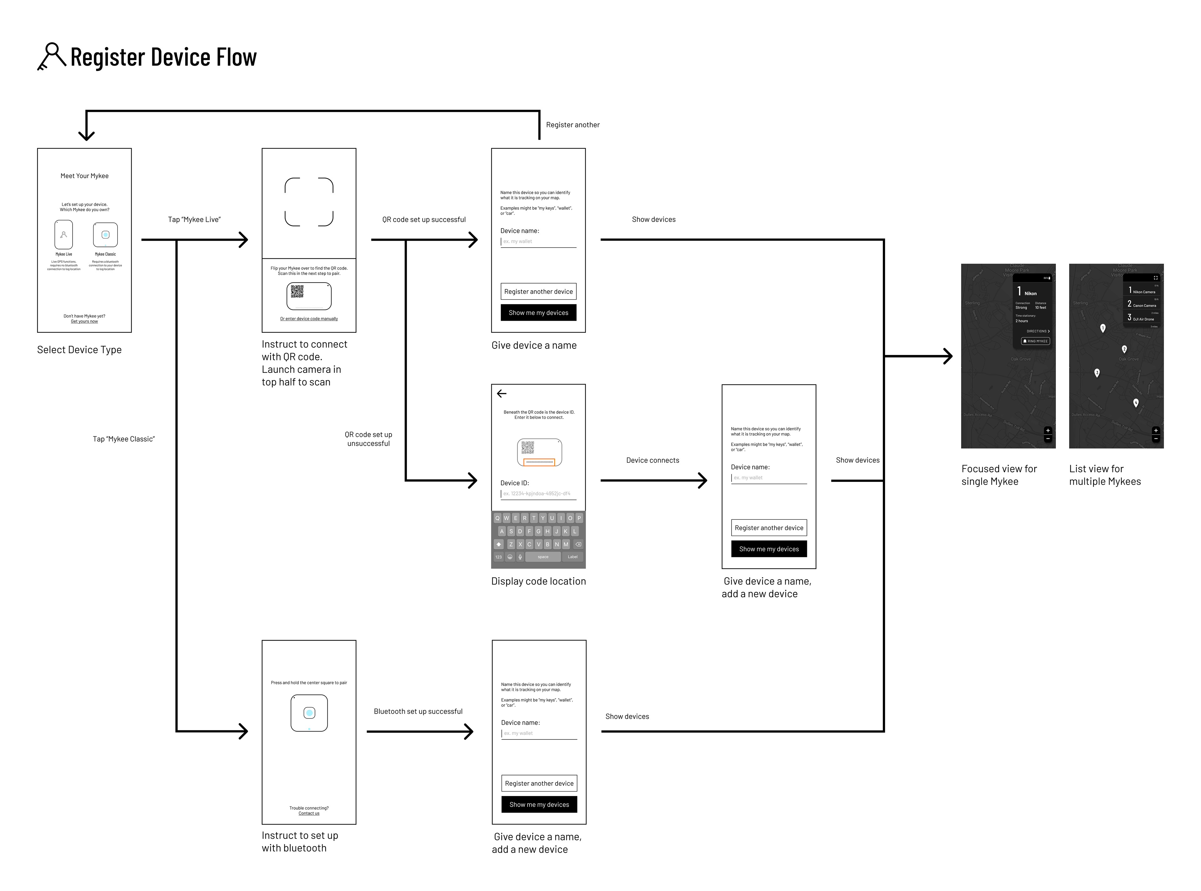
When I got involved with the project, what was required for the next version was unclear. It seemed like the plan was to make a separate app for the Live version, and that was about it. I pushed a little more to understand tech constraints and requirements, and developed a list of my own.
1. The trackers need to be displayed on a map.
2. It needs to be able to display multiple trackers at once.
3. The pairing process must be explicit in the application.
4. The app must display meaningful data and present useful actions relating to the trackers.
5. The user must be able to remove an device with which they previously paired.
6. The devices must be able to be named. A random device ID is not helpful in identification.
This was the list of required functionality. Anything else would be optional or post-MVP.
I immediately set to work sketching out more optimal flows for what had already been built combined with the requirements for the new product. After iterating a few times and some low fidelity user testing, this is the product registration flow I came up with:
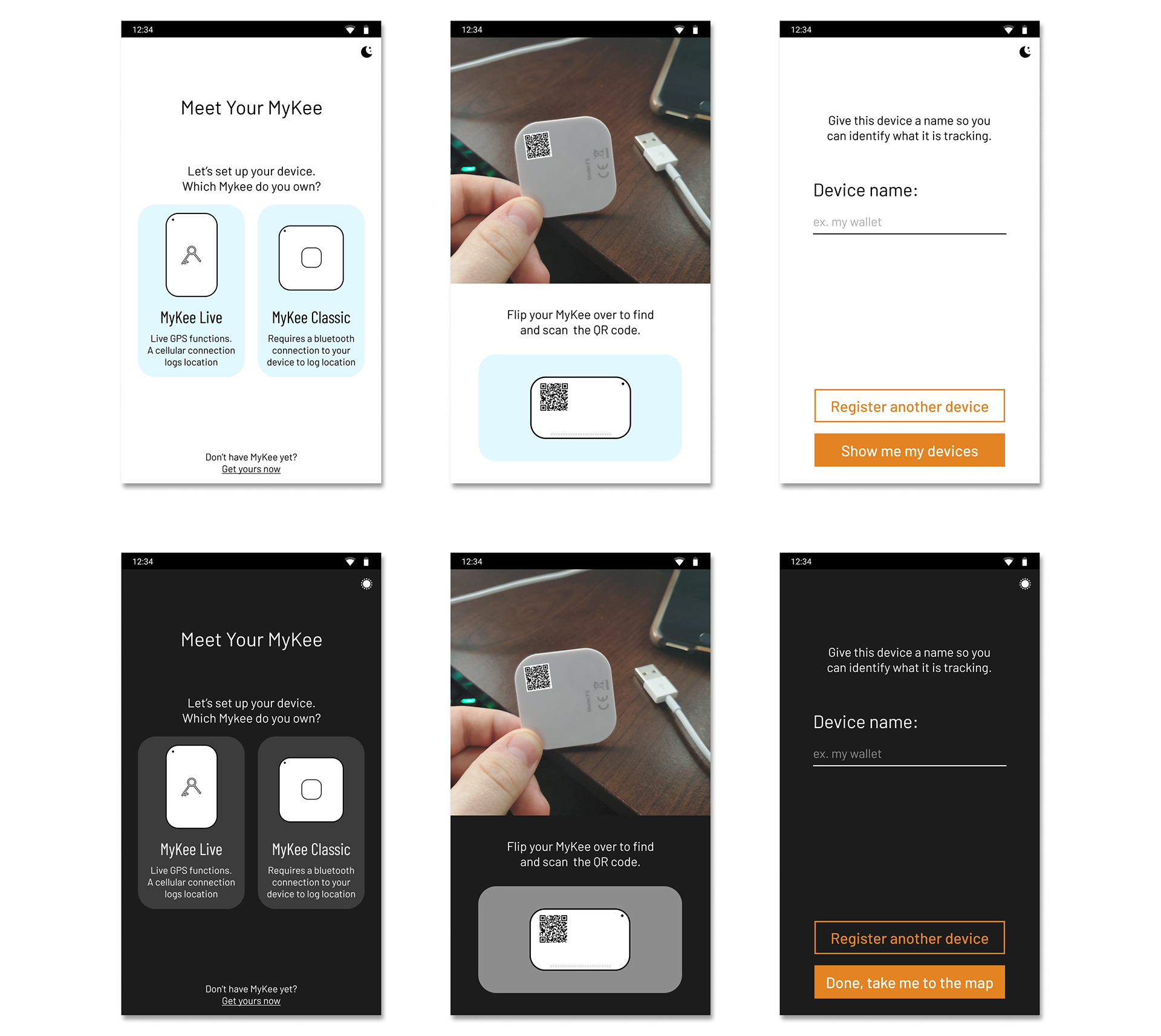
Light and dark mode for pairing. Since the functionality exists later in your user journey, I introduce it here up front to teach the user to look out for it later on in their menu.
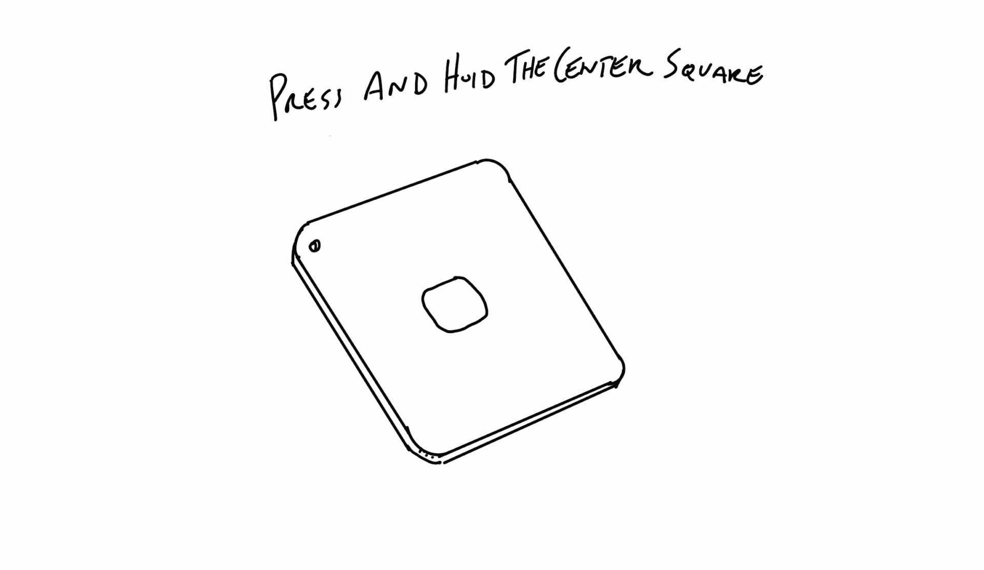
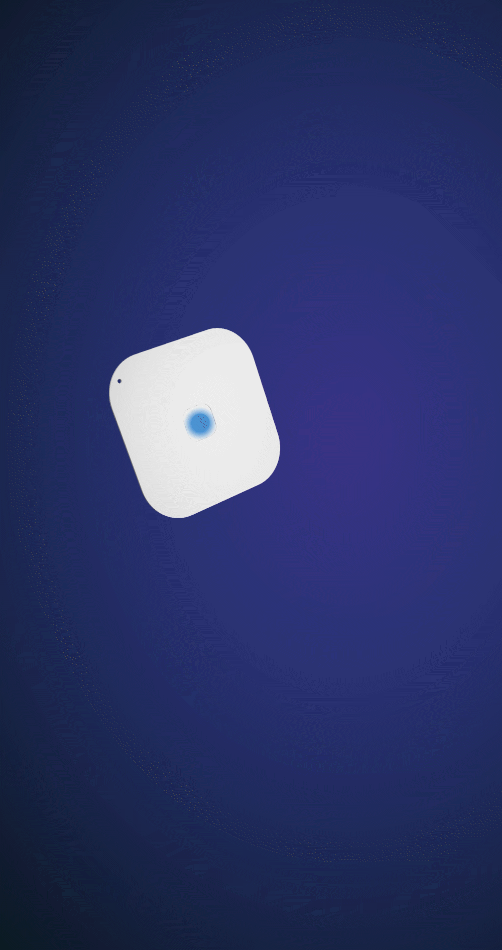
I tried my hand at 3D modeling for the first time to create this concept for pairing on the right. It was fun, but didn't fit with the aesthetic of the rest of the app.
Map and Device List
The meat of the mobile app is the map and device list, and this is where I focused the majority of my attention. I wanted something that was simple to understand, but very robust for power users. I settled on just a few key pieces of information present on landing of the map: the device location icons, a condensed list of the first few paired trackers, the number and name of those trackers, and their distance from the user. Everything else would be hidden either in the device details or a menu.
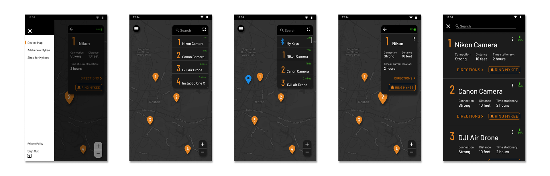
Paired bluetooth "Classic" devices would be shown up top and not given a number, as you can only pair one at a time. All others would have a number corresponding to a location icon on the map. Tapping on the icon or a device in the list will center the map on that tracker and display a focused view of the device window.
The device window is searchable, scrollable, and dynamically expands to show up to four devices without scrolling. The focused view of the device displays additional relevant information: connection strength, approximate distance from the paired phone, and how long that tracker has been stationary. In the top right corner of the device window is a "full-screen" icon. Tapping that will display the screen on the right for easier browsing in case you own many trackers.
In the menu you can sign out, view the privacy policy, shop for more MyKees, register another MyKee, make your way back to the map, or toggle between light and dark modes.
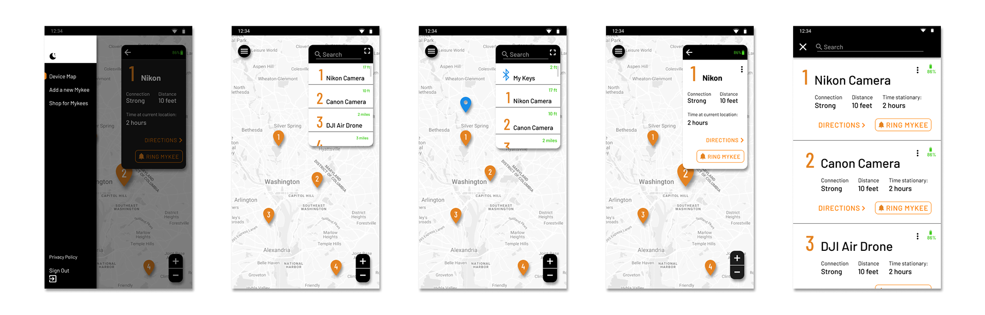
I am all about options. Give them light mode, but default to dark since it is objectively better.
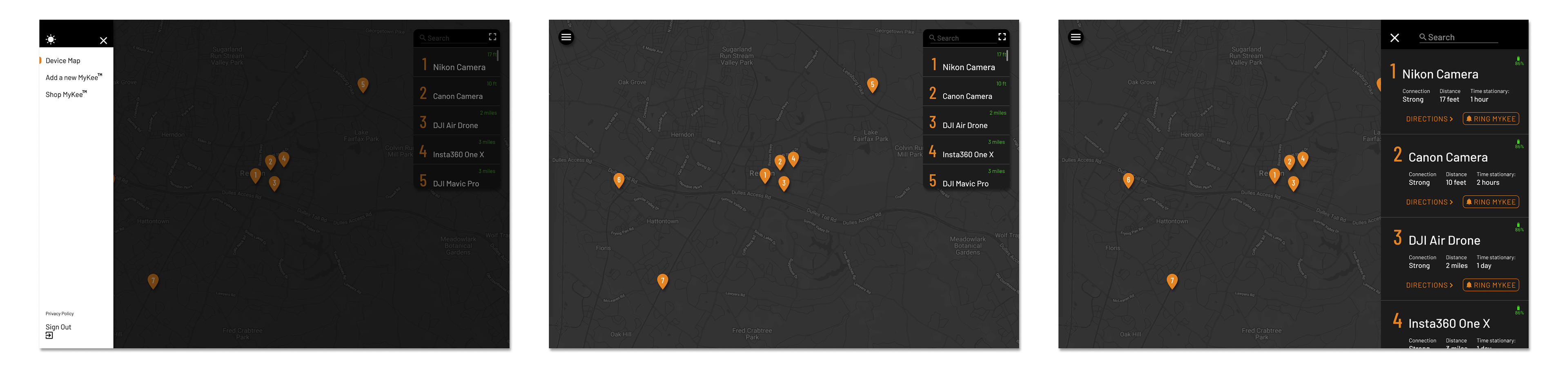
These are the landscape tablet dimensions of that same screen.
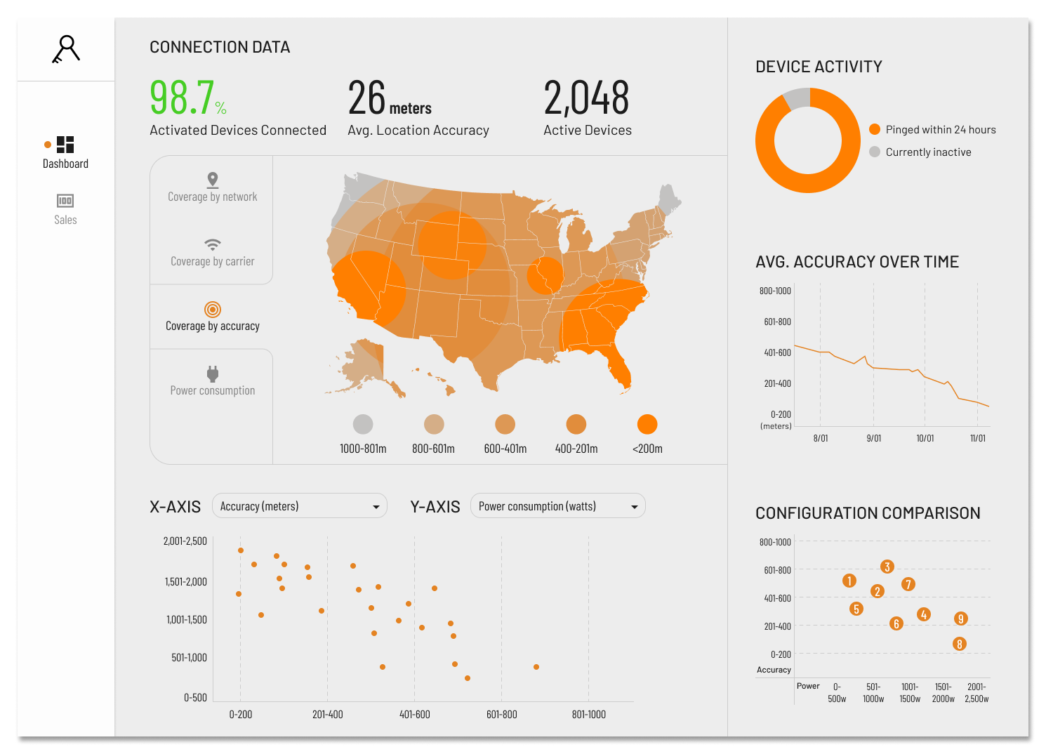
Monitoring Our Success
The latest thing I designed for MyKee was a dashboard where we can monitor our connectivity rates, location accuracy, signal strength across the country, and the efficacy of different software configurations among other things.
While Mykee no longer exists as a company, I am grateful for the time I spent working on it. After less than two months of operation, we had hit profitability by selling more than it cost to produce the Mykee Classics. I never intended to be self employed, but got involved with the project because it looked like fun, and that was certainly the case!
Thank you for reading!
Michael Costello